Below is a link to my evaluation which i have made on Prezi:
https://prezi.com/pic0rmq5xqkw/media-evaluation/
Monday, 18 April 2016
Final Double Page Spread
After creating three different double page spreads (below) :


This was the final product i created using InDesign:


This was the final product i created using InDesign:


Wednesday, 2 March 2016
The design process
While designing my magazine pages, although I knew how i wanted them to look and what I wanted to put on them there were certain things which I tried and tested to see what looked best. For example I tried many different fonts, particularly for the masthead on the front cover, here are some which I tested:


In the end I chose Gill Sans Light as I thought this best suited my magazine house style and the audience I am targeting.
Wednesday, 17 February 2016
Designing my Music Magazine.
I have been looking into what I would like to call my
magazine, taking into consideration I am focusing on a music shop that also
runs many other businesses such as tuition, instrument building and has many
small bands I searched online to help me come up with a few to choose from, I
found a website that randomly generates band names (http://www.bandnamemaker.com/) and
used this to come up with some inputting the word music, here are some possible
ideas:
-Music Invader
-Music Surface
-Music Beyond Force
Another thing I did was think about musical terminology
which could also work as a title by looking good and sounding right/catchy to
fit my magazine genre and design, I came up with the following:
-Bass
-Chord
-Music Key
-Score
-Tempo Knowing that I would be taking my photos and doing the interview fairly soon, I wanted to be ready to get straight to putting my front cover etc together as soon as I could so I sketched out designs of how I would like my cover, contents and double page spread to look like also thinking of the smaller details such as cover lines and where I would like things to be positioned, below are my photos of my drawn out designs:
FRONT COVER-

CONTENTS PAGE-

DOUBLE PAGE SPREAD-
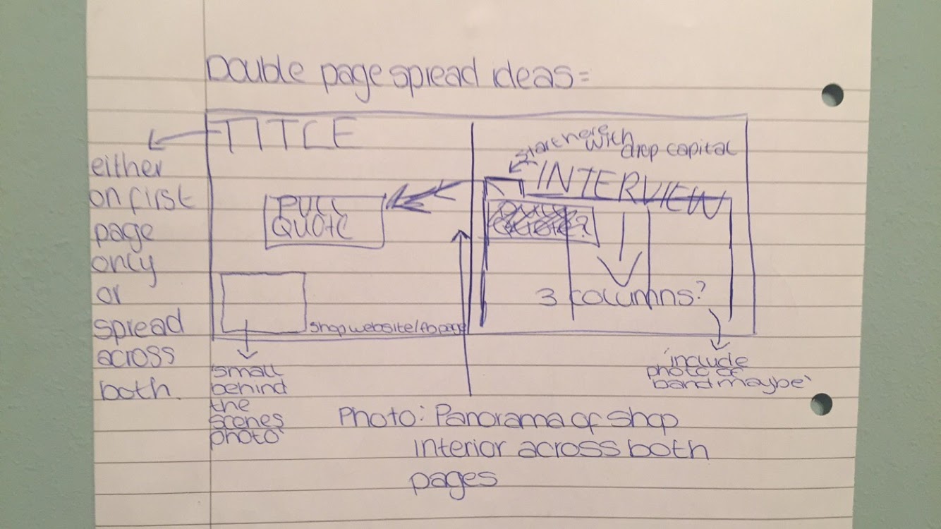
Having these plans will enable me to get straight into the designing process once I have my photos and interview, it will also show my progress should I decide to change any aspects of these design ideas during the process.
Monday, 8 February 2016
Interview questions for my music magazine.
I have come up with with some questions that I would like to ask during the interview for my music shop magazine, these are a basis of what I will ask but some may change depending on their answers. The following are 23 questions I came up with:
1) Name? Age? Come from?
2) How long have you had this
business? (Do you remember the date?)
3) Address of shop? Where is
it based and why did you decide to base it where you did?
4) Why did you decide to name
the shop ‘String Salon’ and the tution side ‘Rainbow music’?
5) Why did you want to open
up a music shop ad start doing music tuition?
6) How did this business
start out?
7) Do you play/are you
passionate about music and why?
8) What instruments do you
play and when did you start playing? / When did you realise your love for
music?
9) What do you do here at ‘Rainbow
music’ other than the shop and music tuition?
10) What is the most popular
area of ‘Rainbow music”?
11) How many staff do you have
working for you?
12) Do you get along with all
your staff and customers?
13) How busy do you get in the
shop and other parts of ‘rainbow music’?
14) Tell me about the
customers that come into the shop, do you have any regulars? Are they all
friendly? What kind of age range do you have come in?
15) Tell me about the bands
you have here at ‘Rainbow music’ and the people in them. How many bands
altogether? Concerts/Gigs?
16) Do you enjoy your day to
day life working with this business?
17) Does it ever get
stressful? / Do you find it difficult to separate owning the business and your
everyday life?
18) Have you made any friends
through the business, staff or customers that you spend time with outside of
work?
19) Any funny stories about
the shop or working here?
20) How has the shop grown
over the years?
21) How long do you see
yourself having this business?
22) Any exciting upcoming
plans?
23) How do you see this
business in the future?
Having these questions ready before my interview helps to keep me organised and prepared. It also gives me the advantage of planning ahead for my double page spread and article.
Monday, 1 February 2016
Research for my magazine.
This week I am focusing on further
research for my music magazine. As I have chosen to create a magazine based
around a music shop instead of a band or artist I am going to research into
magazines like this and how to photograph it for my front cover, contents and
double page spread.
I looked at their website http://rainbow-music.co.uk and in their 'shop' section. I found out what they sell and what brands they stock along with a little information about them and where they are situated and the opening times of the store and some photos:


After visiting their website I looked at their Facebook page https://www.facebook.com/rainbowmusictuition/ . Here I could find some more information about the shop:

There were some more photos and even some videos of bands that they have playing some gigs:

Finally I found some reviews posted on their page that I can look at to gather information for when creating my magazine and an events page showing some events they have recently held:


From here I can message the owner of the shop to organise my interview and photoshoot of the shop itself. Using some of the things I found in my research I now have some basic information which i may be able to include within my magazine double page spread or elaborate on during the interview.
Thursday, 28 January 2016
Magazine Analysis
Magazine
Analysis:
I began by
searching for one specific music magazine, I chose to look at Billboard
Magazine. I looked at all the front covers from Billboard to establish their
house style and similarities that run throughout.

At a first
look I can see that they use a very simple design keeping the coverlines and
much more very minimal. There are a lot of pale colours including mainly greys
with some blues and pinks. They all seem to have a close up or mid shot of the
artist on the front and stick to only one person, in most there is a direct
mode of address.
After
doing some research I found that the target audience for Billboard magazine
varies from young teens from the age of 16 to young adults at the age of 26.
This is because it gives readers the latest updates from the charts of
different and various types of genres. This is shown in the front cover as the
design is very mature and is not overcrowded with images and coverlines.
71% of
readers are aged between 25 to 54 years old. The median age is 34. 82% are
college graduates. 65% are director level or above. The average yearly
household income of Billboard readers is $278, 620. 61% are members of one or
more industry assasiations such as BME, ASCAP, SESAC, AAAA and others. 51% are
men and 49% are women. The genre of Billboard magazine is R’n’B and pop music.
It is run by the company who decide the top 100 songs in the US therefore it
contains information and music artists who are currently in the top 100, this
makes it appeal to a larger audience because as it contains facts and up to
date news on the charts and relevant artists.

Masthead:
-The masthead is
kept simple on this magazine, it’s in the top left hand corner instead of being
completely across the top and the artists head is brought over the top to avoid
having his head covered. Billboard are a well-known magazine and readers can recognize
it without having to read the full name. The white is simple and shows
sophistication, informing readers that this magazine is mature and full of
information, suiting the age group of its target audience.
Main Coverlines /
coverlines:
-There are minimal
coverlines on this cover, this is so it’s not too busy and your focus isn’t
taken from the image. It also tells the reader brief information making them
want to read the article inside. The colours, similar to the masthead, are kept
simple with black and white giving the same effect as the masthead does and
fits the colours of the image, contrasting well with the background.
Image:
-The image is of
Drake, a rapper. Billboard have chosen Drake for the cover of this magazine
because he is a relevant artist and will draw in a younger audience as many
think of him as a figure to look up to.
-Drake is well-known
but his name is written very large across the middle of the cover, this is
because Billboard want to advertise that they have him on their cover and
people are more likely to pick their magazine up seeing the word ‘Drake’
plastered across the front. The words ‘finds happiness’ fits with the image as
he smiling or laughing and a happier artist draws a bigger audience in this
genre.
- This is a
photoshoot photo rather than a live shot, this way they can get him to pose in
this way to fit the coverline and look more natural in this environment than
flustered on stage.
-There is slight
direct mode of address in this as his head is turned towards the camera but his
eyes are squinting as he is laughing making it look natural, this direct mode
of address is important here so readers can relate not only to his style but to
his emotions also.
-His clothes are
simple but also fashionable, this is something many boys or men would wear on a
day to day basis making him relate and seem down to earth and on the same level
as the reader. The colours of his clothes match the colours of the coverlines
etc on the cover showing consistency and giving it more of a modern, minimalist
style drawing people in.
-The photograph
shows Drake in a medium close up, this is so you can see his facial expressions
and slightly his body language along with his clothes but it isn’t too close up
that it feels like he is invading the readers personal space.
Sources:
billbaord.com
wikipedia.com
google images
This magazine analysis is beneficial for when creating my own music magazine front cover, I will be able to tell what makes a good cover and apply it to my own taking this into consideration when choosing a colour scheme and fonts etc.
Subscribe to:
Comments (Atom)