Double Page Spread Terminology:
We also looked at professional magazine double page spreads to see what makes them good and efficient:
This double page spread has a standfirst which is an introductory paragraph usually in a sans serif font and slightly larger than the article itself however this spread uses a serif font in the standfirst. The title usually uses a serif font but once again this has used the opposite and has a sans serif font. The image in a double page spread is large just as this one so it stands out. This magazine also uses a drop capital which is at the start of an article, the first letter of the first word is written larger than the rest of the article and normally drops down into the article as this one does. There is one large column and no sub-columns used.
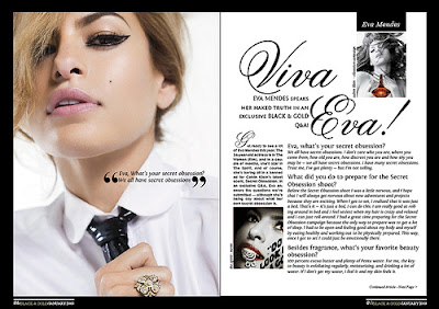
This magazine has gone for the typical serif font for the title and sans serif font for the standfirst. There is a pull quote which is sectioned out of the article and written over the top of the image. The article is a Q&A where the questions are a little larger and bolder than the answers which is the way it usually is in a magazine. There is a drop capital also used in the subcolumn on the left hand side of the second page. A section title is usually at the top of the page and normally in a 'tab' from as this one is.
Looking at these double page spreads gave me the chance to apply the correct terminology while evaluating their good and bad points enabling me to indicate what makes a good double page spread and what makes a bad one when it comes to creating my own.


No comments:
Post a Comment