Monday, 14 December 2015

WEEK 6: INDESIGN SKILLS

After developing our skills in photoshop we moved onto using InDesign, we were shown a few basic skills to begin with:

Setting up a Page:
When you open InDesign a box will appear that looks like this:

You can adjust the page size, amount and size of columns, the size and the margins around the page and the bleed and slug (which we did not use). This way you can adjust your page to exactly how you want it to look.

Adding text and text boxes:
To add text you need to create a text box. By holding down the 'T' on the panel at the side you can select the 'Type Tool':


This allows you to click and drag anywhere on the page and create a text box of any size:


By using the bar across the top of the page you can then change the font, size of the text, space between the letters, height and width of the letter etc, similar to what we did in photoshop:


Adding pictures and picture boxes:

To add a picture you need to create a picture box where you want your picture to go, you do this by clicking on the rectangle frame tool:


You then click and drag the same as with a text box to the size you want it to roughly be and it should look like the picture below with a cross through the box:


Importing and Resizing images:

To insert a picture you can drag the photo you want from the folder straight into the rectangle frame tool in InDesign however it may not fit properly in the box you have drawn:


To resize your image to fit the box you can click the photo and see a brown frame appear which shows the actual size of your photo, by holding down shift to keep it in proportion and dragging the corners to fit the box the photo will the fit exactly how you want it to:


Another way of getting the picture to fit your box is by clicking 'Object' at the top of the page, going to 'fitting' and choosing 'Fit Frame Proportionally':


Using either way the photo will end up fitting properly in the box you have created:


Adding, creating and changing colours:

To change the colour of something you have to click 'Color' in the right hand side bar and then double click the small box with the colour in it that if you hover over should say 'Fill':


The 'Color Picker' will then come up allowing you to chose any colour you want, once chosen you can chose 'Add RGB Swatch' to add the colour to your swatches so you can use that exact shade again and find it easily if you need it:


With our new knowledge of how to use InDesign we can begin creating contents and Double Page spreads as practise for our preliminary task and main task before creating our final ones so we can develop our skills further.

Thursday, 3 December 2015

WEEK 5: DOUBLE PAGE SPREAD TERMINOLOGY

Double Page Spread Terminology:

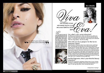
We also looked at professional magazine double page spreads to see what makes them good and efficient:


This double page spread has a standfirst which is an introductory paragraph usually in a sans serif font and slightly larger than the article itself however this spread uses a serif font in the standfirst. The title usually uses a serif font but once again this has used the opposite and has a sans serif font. The image in a double page spread is large just as this one so it stands out. This magazine also uses a drop capital which is at the start of an article, the first letter of the first word is written larger than the rest of the article and normally drops down into the article as this one does. There is one large column and no sub-columns used.


This magazine has gone for the typical serif font for the title and sans serif font for the standfirst. There is a pull quote which is sectioned out of the article and written over the top of the image. The article is a Q&A where the questions are a little larger and bolder than the answers which is the way it usually is in a magazine. There is a drop capital also used in the subcolumn on the left hand side of the second page. A section title is usually at the top of the page and normally in a 'tab' from as this one is.
 
 Looking at these double page spreads gave me the chance to apply the correct terminology while evaluating their good and bad points enabling me to indicate what makes a good double page spread and what makes a bad one when it comes to creating my own.

Wednesday, 2 December 2015

WEEK 4: PRACTISE COLLEGE MAGAZINE COVER

Using the photos we took we had to chose one and create a college magazine cover as a practise for our preliminary task of creating our own college magazine, This is the photo i chose to use:


This is the finished magazine cover: 


I applied the title of 'college' across the top and then also added some coverlines, with the photo itself I upped the brightness slightly and also the contrast so the picture was clearer and warmer looking. I photoshopped in a barcode just underneath the title also.

This gave me the chance to practise once again before carrying out the preliminary task and also gave me the opportunity to practise editing a photo I had taken.

WEEK 4: TAKING OUR OWN PHOTOS

After looking at other magazine covers and doing a practise one we had to do another practise but this time using our owns photos that we had to take ourselves, here are some of our ones:


The photo below is the photo I chose as my final image for my front cover: 


We used our knowledge from evaluating magazines to position ourselves in a way we thought looked best and most professional.

WEEK 3: PRACTISE FRONT COVER

Our Task was to take an image from the internet and turn it into a front cover using the skills we already knew in photoshop alone:


This is the photo I chose before.


I added the title of the magazine and put it behind her head by using the cutout tool in photoshop to cut out the top of her head and making it a separate layer put the text behind it. I then added coverlines around the page making sure not the cover her face and sticking to one colour to make it look simple but sophisticated. However it's a little bit too simple and sparse so I would have to look at moving the cover lines around and maybe adding a few more.

Doing this simple exercise has given me more practise and understanding of how to create a front cover and gives me the chance to improve on my next one.

WEEK 3: FRONT COVER PHOTOGRAPHY

We evaluated magazine front covers and how the people were photographed:


Three person front cover:
Stood even closer together.
The first has one person at the front and the other two getting further away but so they are still in the shot.
Second has all three standing in a line but slightly turned and very close together so they all fit into the shot.
Both Mid-shot
Colour scheme on both.
Direct mode of address.


Four/Five Person front cover:
In both the people are very close together.
One person (maybe the main singer) is front and central while the others are gathered around closely behind.
Colour scheme.
On the second one the front persons head slightly covers the masthead but on the first one this is not the case.

Direct mode of address.


Two People front cover:
These people are stood close together. (shoulder to shoulder)
Their heads cover the masthead again.
They are the main focus, only one cover line.
Colours are simple and few.

Mid-shot again.


One Person front cover:
The positioning of both people on the two magazines are central.
The photos are both mid-shot.
Their heads are covering the mastheads so the magazines must be well known.
They both have direct mode of address.

The colours are very simple.

Looking at these will help me when taking my own photos for my front cover as I know how people should be positioned and what they should look like to make a professional front cover.